Creating the Art for “A Token War”
Finding the style and substance for indie game art as a developer
By: Brian - UpRoom Games Founder / Resident Art Person
***This post will probably make more sense if you check out A Token War first. Go ahead, I’ll wait.
When I started development on “A Token War,” there were a few things I was confident in my ability to do myself: programming… and… well I guess just programming. Unfortunately that meant there were a few things that I wasn’t sure about, one of the biggest being the art. In this post I’m going to talk about the process I went through as a indie developer trying to both find an art style and create original art for “A Token War.” If there are other developers entering the art-creation space I hope my experience will be helpful, or maybe just serve as an example of “how not to do it,” either way.
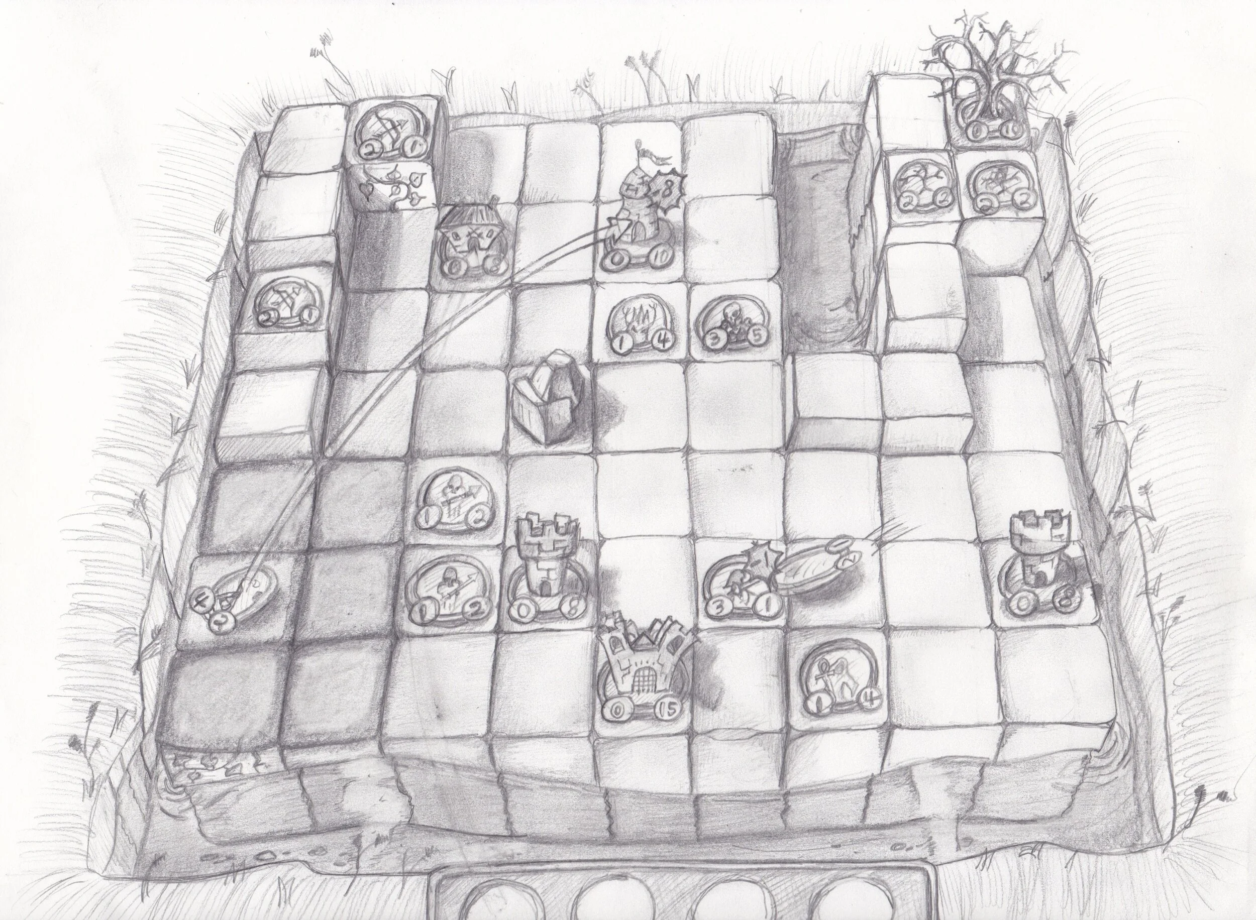
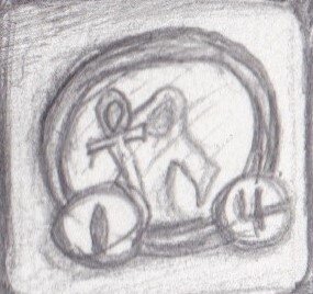
The first thing I started to do when trying to find the art style for “A Token War” was make some concept sketches. I had a picture in my mind about what I thought I wanted the game to look like, but it was sort of out of focus. I guess maybe it was just a poorly formed idea but “out of focus” sounds more...art-ish. This is what I came up with after trying to commit what was in my head to paper.

There are a lot of aspects of this I liked and the basic form of the current game is definitely here. I think the board being surrounded by water was supposed to evoke the feeling of a medieval keep surrounded by a moat, and I still like the idea of little models popping out of the Structures and Strongholds. I’ve been calling this image the “Key Art” for the game, since it captures the feeling I was going for if not exactly the specifics. Notably the UI is mostly non-existent and there aren’t really any props to decorate the game area, but the overall aesthetic is pretty well formed.
Having this sketch was a good start, but since the game I was working on continued to look like this for weeks on end -


clearly the key art wasn’t enough. When I get stuck in a programming problem, I usually try to find the constraints I have to work within and attempt to get some inspiration from the limitation. Sometimes it works sometimes it just makes things harder but I figured I’d give it a try with the art.
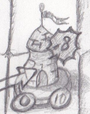
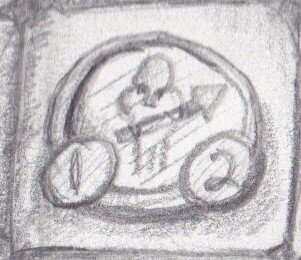
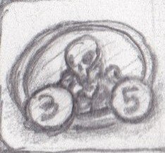
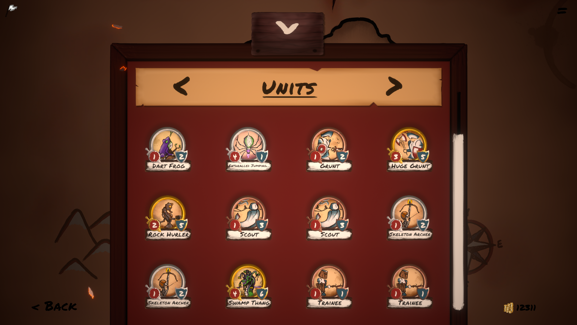
I knew I had to keep things simple since I’m a novice artist at best, and the aesthetic needed to be complimented by a simple thematic UI since graphic design literally gives me nightmares. Unfortunately for my key art, simple didn’t really include miniature models of medieval buildings since the extent of my 3d sculpting pretty much started and ended with extruding a cube at this point. With that decision made I knew I had to focus even more on the visual style of the Token portraits, since they would have to feature much more prominently. For figuring out a portrait style I used the same set of restrictions as a jumping off point. Since I would be drawing all of these by hand I knew they had to be heavily stylized and in a simple style that was easy to replicate over and over again without looking boring. Let’s take a look at the portraits scribbled in the key art, quick sketches designed to give the right impression and feeling when scaled down.
O.K. da Vinci these are not, but the extremely simplistic line drawings were helpful in finding a style that would work for me. I spent a long time just sketching and re-sketching these tokens with different line styles and aesthetics, trying to find something that felt right. If there is a secret artist trick to quickly finding a style I would love to know it, but all I did was try over a dozen different sketches to find something that didn’t look terrible and I could reproduce. Here is one of the pages from my sketchbook that includes a few experiments and then the final design for a few Tokens (I don’t know why I doodled a dinosaur here and I really don’t know why it seems to have a human eye, it’s upsetting to me now but here we are.)

The evolution of the Grunt from Key Art, to quick sloppy doodles, to realized Token is a good example of the process I went through for almost all of the portraits in the final game. After drawing about 50 of them I got a lot better at just sitting down in a drawing program and creating something from scratch, but I still like to start with sketches when I have the time to.
Once I had a style I liked for the Tokens, I needed to figure out what the finished paintings would look like, since as much as I like line art I realized pretty quickly that it’s tough to differentiate these portraits at the scale they would render in game. As with finding the style, there was unfortunately no real secret sauce to figuring out the painting technique. I tried a bunch of different things within the constraints I had set out and I threw away about a dozen ideas. I imagine this process is less painful for a more experienced artist, but it was nice to feel like I could take the problem solving skills I developed from studying Computer Science and apply them to creating game art, even if it was a little painful. After the pain, here are some examples of the portraits I came up with.
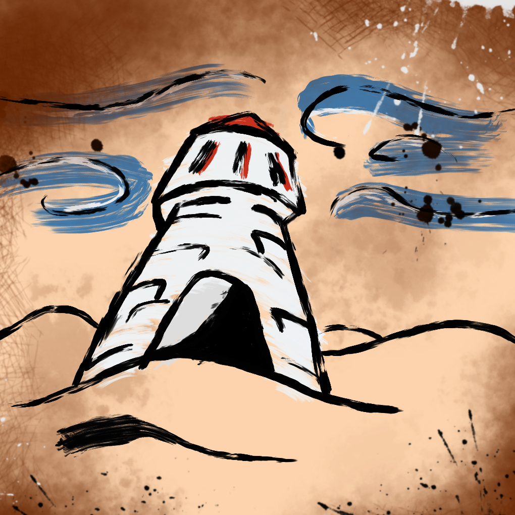
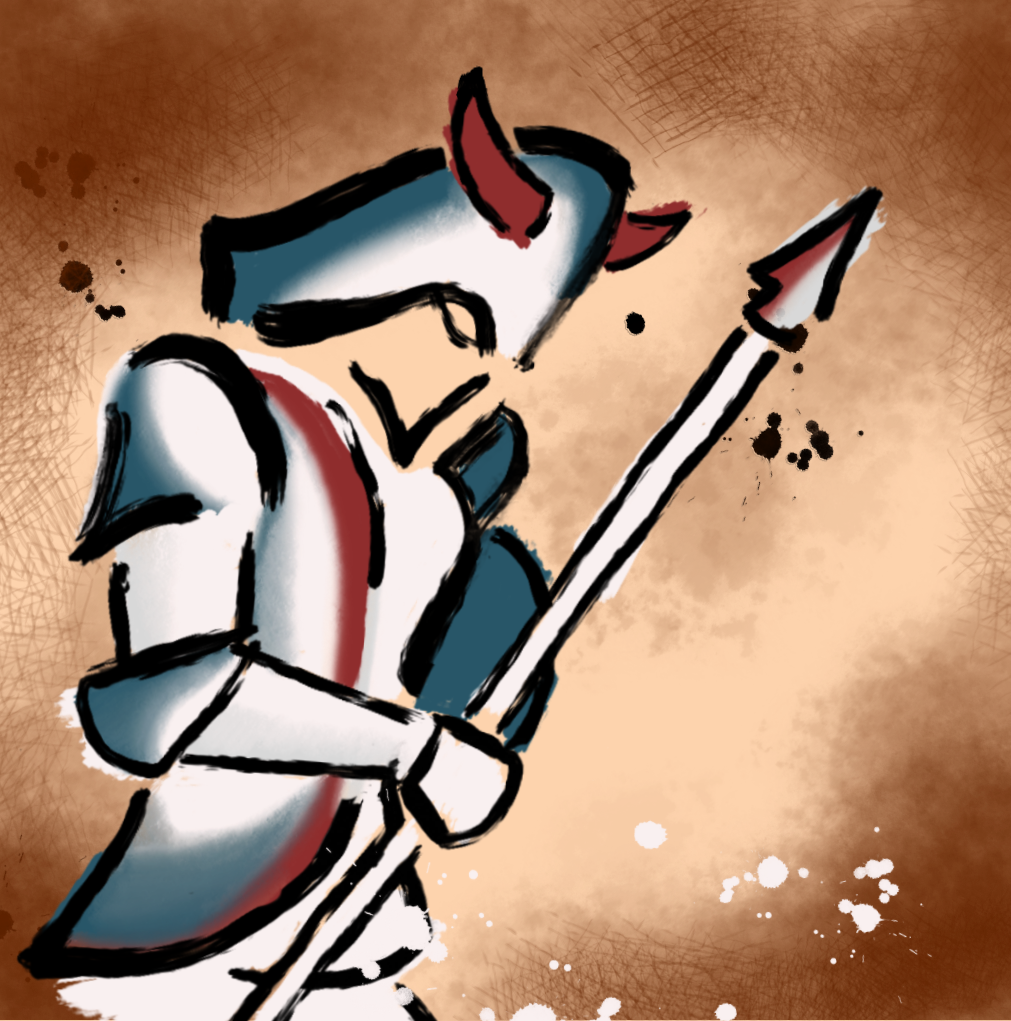
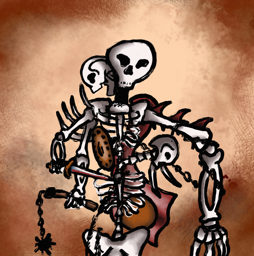
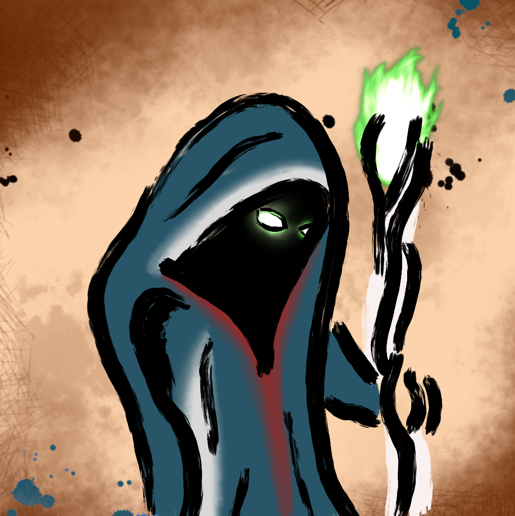
The painting style actually wound up being inspired by a visit to an old block printing exhibit at an art museum, which I was definitely not expecting. The parchment background came about by literally selecting the background of my first token and spinning around the color wheel a lot to see what different tones looked like. When I landed on this tan color it reminded me of parchment and I felt like it fit pretty well. I think this whole art-stuff experience has really shown me a lot about creativity being a strange combination of determination and dumb luck, but I’m not sure that makes it any easier when you’re 70 portraits deep and can’t see the light yet.
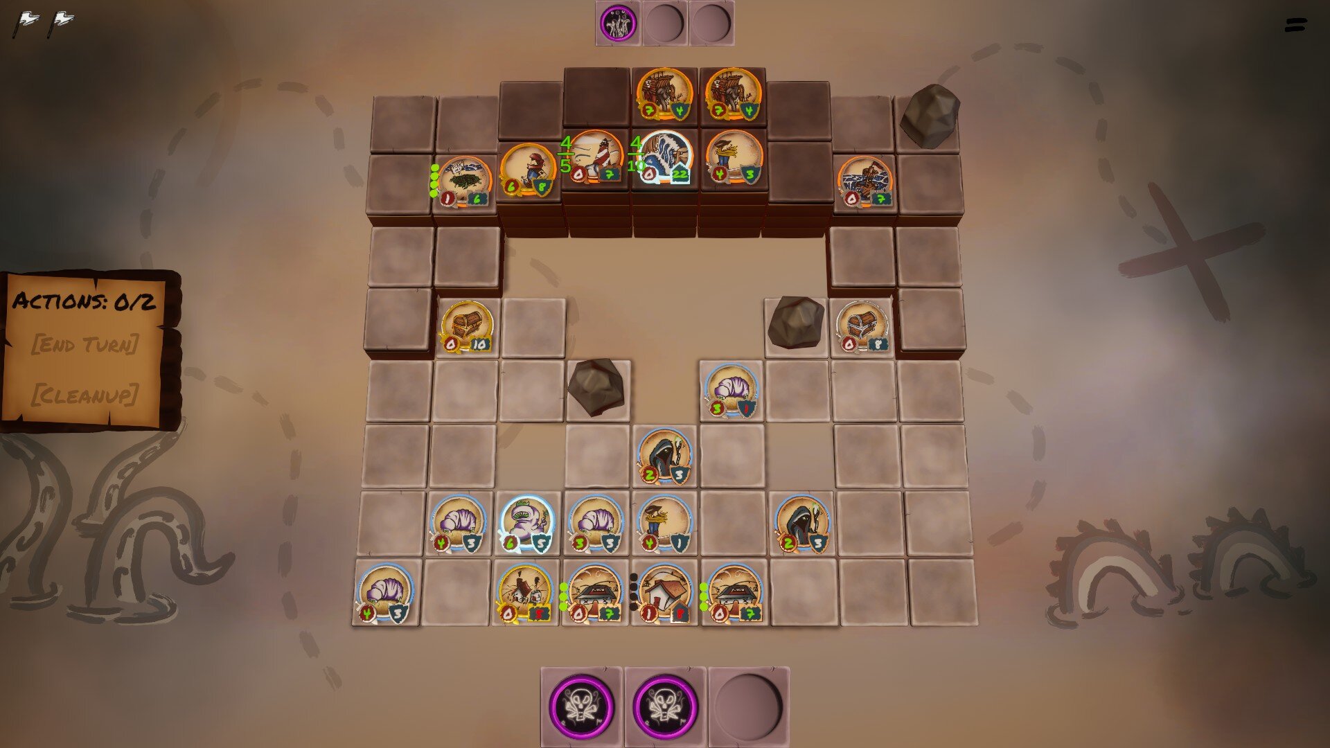
After finding the Token style, I could put together a slightly more cohesive demo for the game using the parchment style, this is what I wound up with.

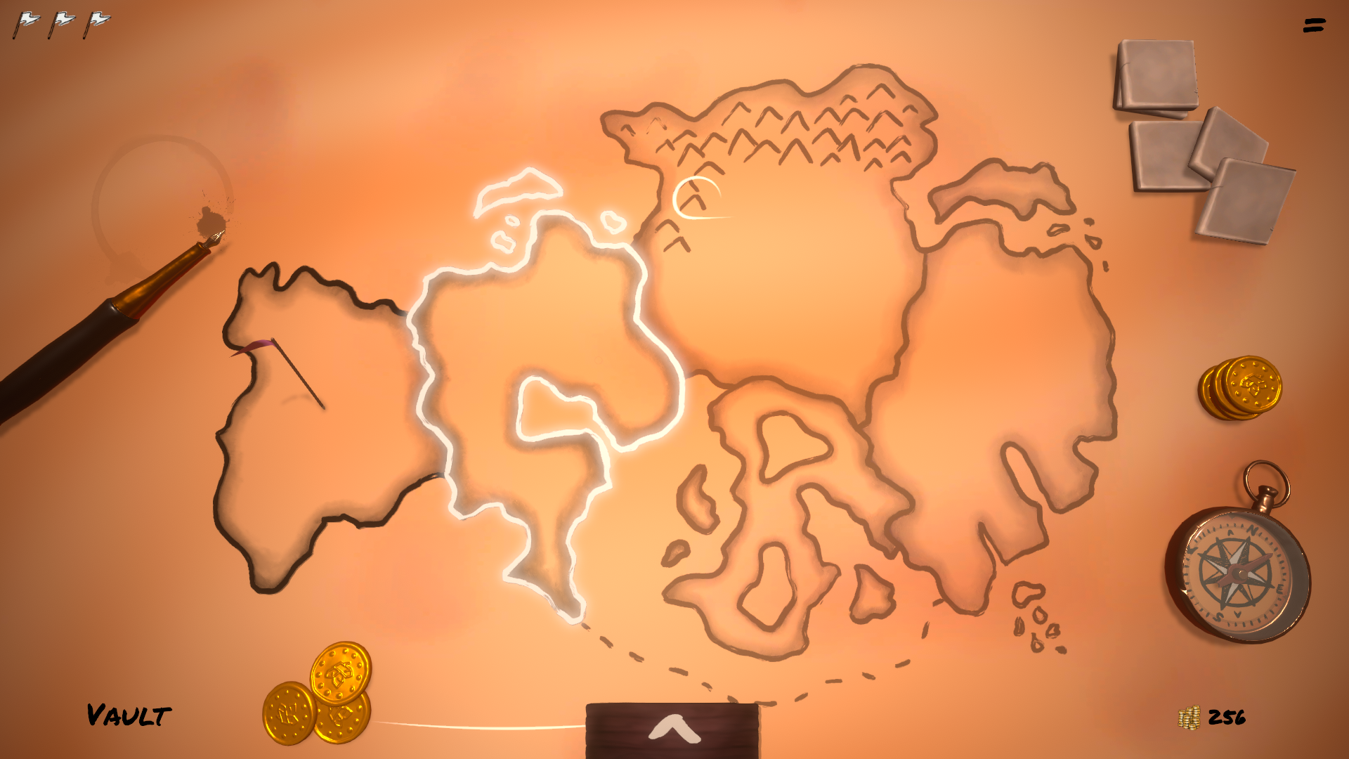
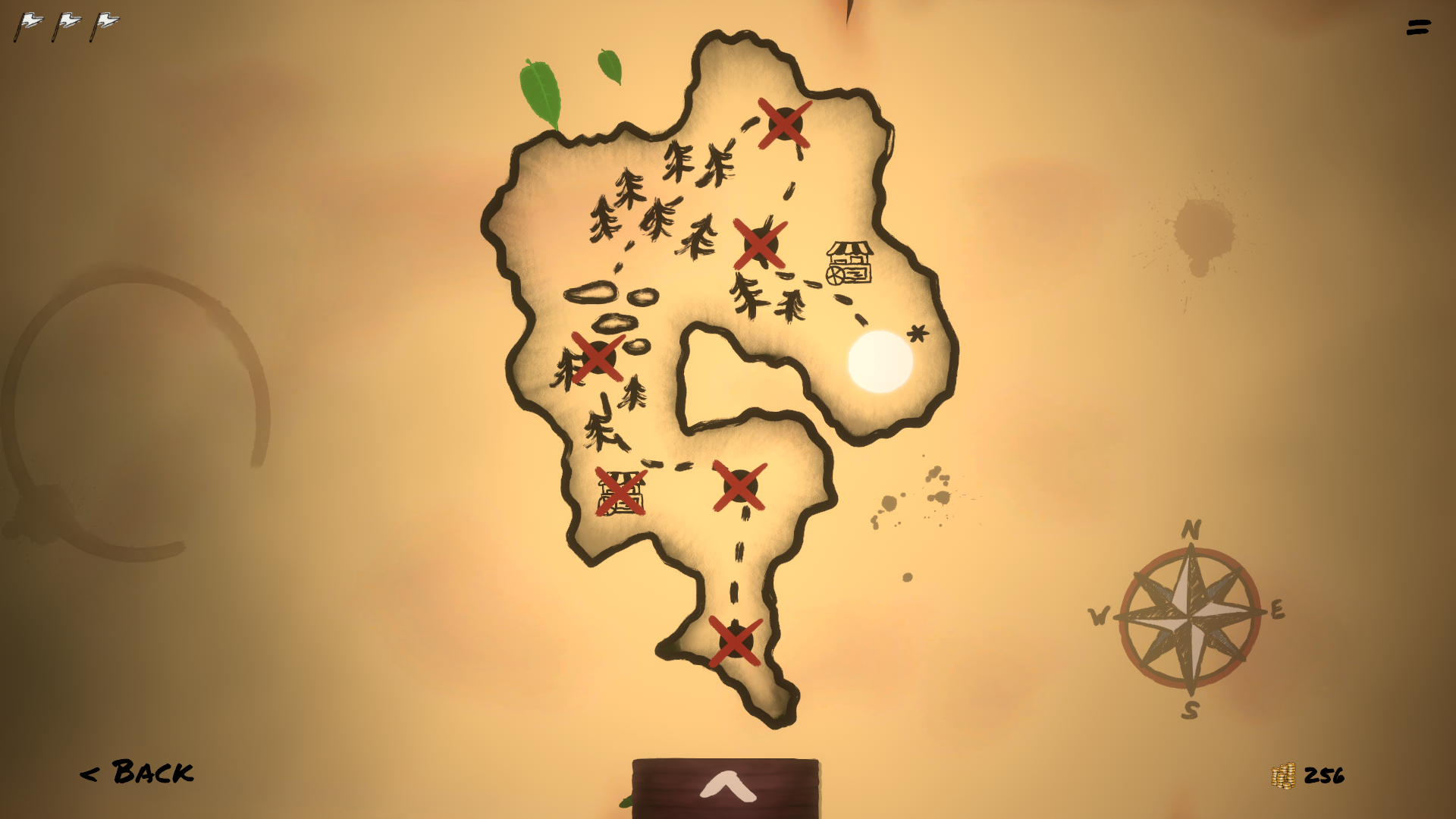
The Tokens are a clear improvement but there is still a lot to be desired in the board itself and especially in the UI. From here however, the improvements were a little more gradual. I started with settling on a UI style that mimicked the token art, relying heavily on parchment and ink as well as splashes and droplets of paint, which I again found by accident when playing with the brushes in the drawing program I was using. After refining the UI I looked at my constraints again to inspire game board decoration. I needed something relatively easy to make and preferably modular so I could make variations for the different zones and themes I was playing with in “A Token War.” I also wanted to minimize 3d modelling and keep things uncluttered since the game itself was involved enough. Since I had this parchment and ink thing going on from the Token portraits I decided to look at some old sea charts and maps for inspiration and I decided to really lean into the “battle map” aesthetic. I tried to evoke the feeling of actually commanding an army from afar and moving pieces in a cozy command tent on top of a stack of maps, rather than sticking to my more abstract “grass and moat” theme from the key art. After adding some particle effects and watching some 3d sculpting tutorials, the final product wound up looking like this.
I’m not trying to skate over any details here, everything was just very incremental and in the same vein as finding the style for the first portrait sketches. I tried many different versions of these things and slowly improved on them over time, sometimes completely changing my mind and sometimes regretting the fact that I had completely changed my mind. I began the whole “art process” with a lot of trepidation, I always enjoyed drawing, but unlike with software development I’d never attempted something on a commercial scale so I wasn’t sure I’d be up to the task. I’m positive that a professional artist and UI designer could have done a far better job, but I think that going through this process has been incredibly valuable for me as a game developer. It has shown me how to work through problems I felt ill-equipped to handle and also shown me where I really should just hire someone instead of being stubborn about it (I still have graphic design nightmares) Either way, I hope there is some utility in talking about all of this for other developers out there who may be in the same position, or maybe for some artists who want to let me know how wrong I am. If you fall into either of these camps, or just want to say hey you can find me @UpRoomGames on Twitter!
***Also, don’t forget to Wishlist A Token War on Steam! Coming Spring 2021, featuring all this fabulous art and more!